Chicken Hut
Identity / Web Design
While working at Kompleks Creative, this hypothetical re-brand project was assigned. I tackled this brand redesign for a local historic Durham Restaurant, The Chicken Hut.
Firm: Kompleks Creative
Art Director: Tobias Rose
background
With over 60 years of continuous operation, The Chicken Hut holds the distinction of being the second oldest restaurant in Durham. Throughout its long-standing history, they have been dedicated to serving delicious home-cooked meals with a daily-changing menu. As Durham undergoes constant growth and change, The Chicken Hut recognized the need to refresh its branding while still honoring its rich heritage.
ideation
During my research, I came across a captivating old photograph of the original location, known as The Chicken Box, established in 1957 by the late Claiborne Tapp Jr. This photo showcased an iconic neon light pole sign in the front of the restaurant, which instantly sparked my inspiration. The retro shape of the sign became the focal point that guided the development of the final logo.
brand
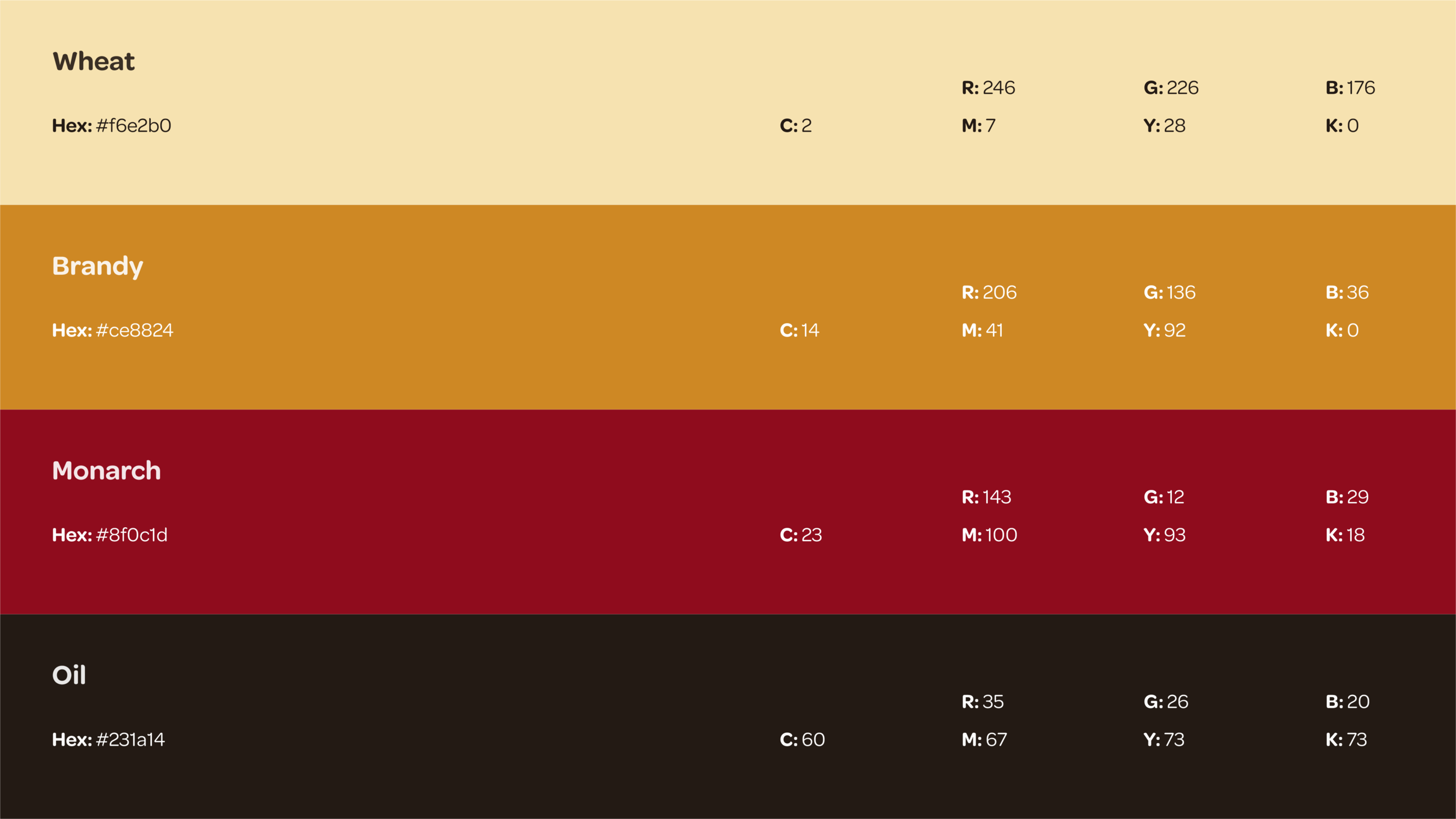
To maintain a genuine connection with the restaurant's existing look while infusing it with a sense of nostalgia, the color scheme was carefully crafted. Warm hues such as beiges, browns, and reds were chosen, drawing inspiration from the beautiful feathers of chickens. This combination evokes a feeling of hominess and heritage, aligning perfectly with The Chicken Hut's identity. Additionally, distressed textures and edges were incorporated to further enhance the desired aesthetic and evoke a sense of authenticity.
Outcome
With the refreshed logo and a newly designed website, The Chicken Hut now presents a seamless branded experience that feels fresh and aligns harmoniously with the vibrant and growing community in Durham. The revitalized brand not only pays homage to the restaurant's history but also positions it for continued success in the future.


