BuzzTender
Identity / UI Style Guide
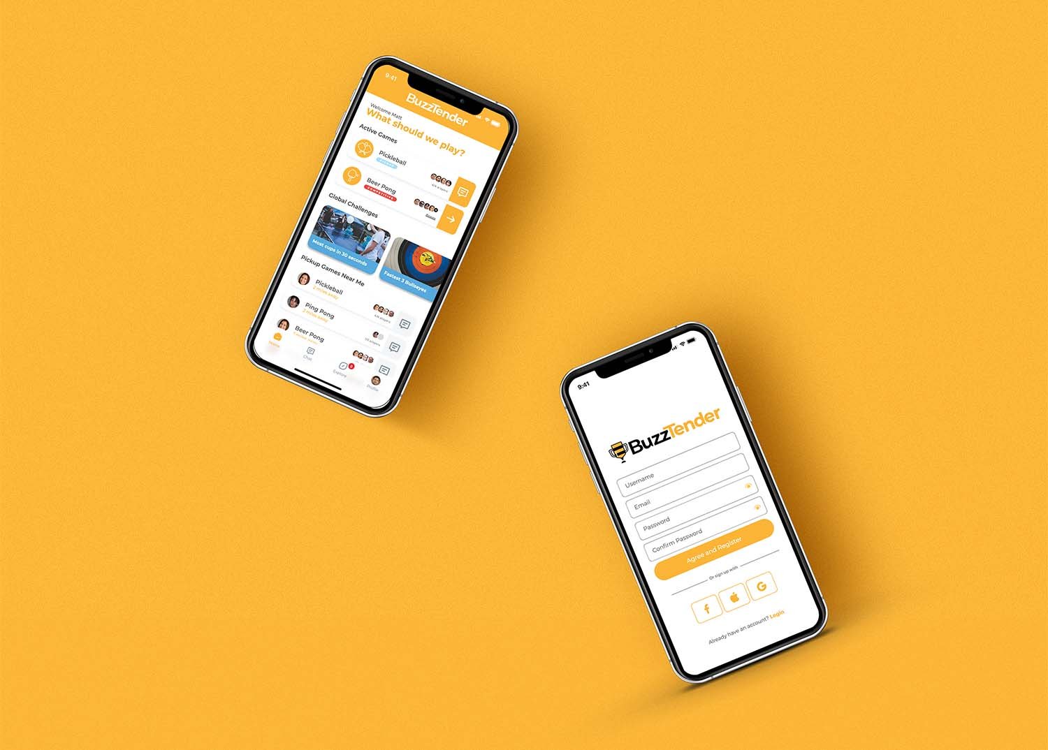
BuzzTender is an innovative app that revolutionizes event creation, global connectivity, and friendly competition. The team at BuzzTender came to me with a beta version of their app, wanting to take it visually to the next level in order to attract a larger audience.
background
The BuzzTender team recognized the need for a captivating identity that would attract users amidst a sea of competitors in the app store. With a focus on intuitive navigation and exceptional user experience, they set out to develop a comprehensive UI Style Guide.


ideation
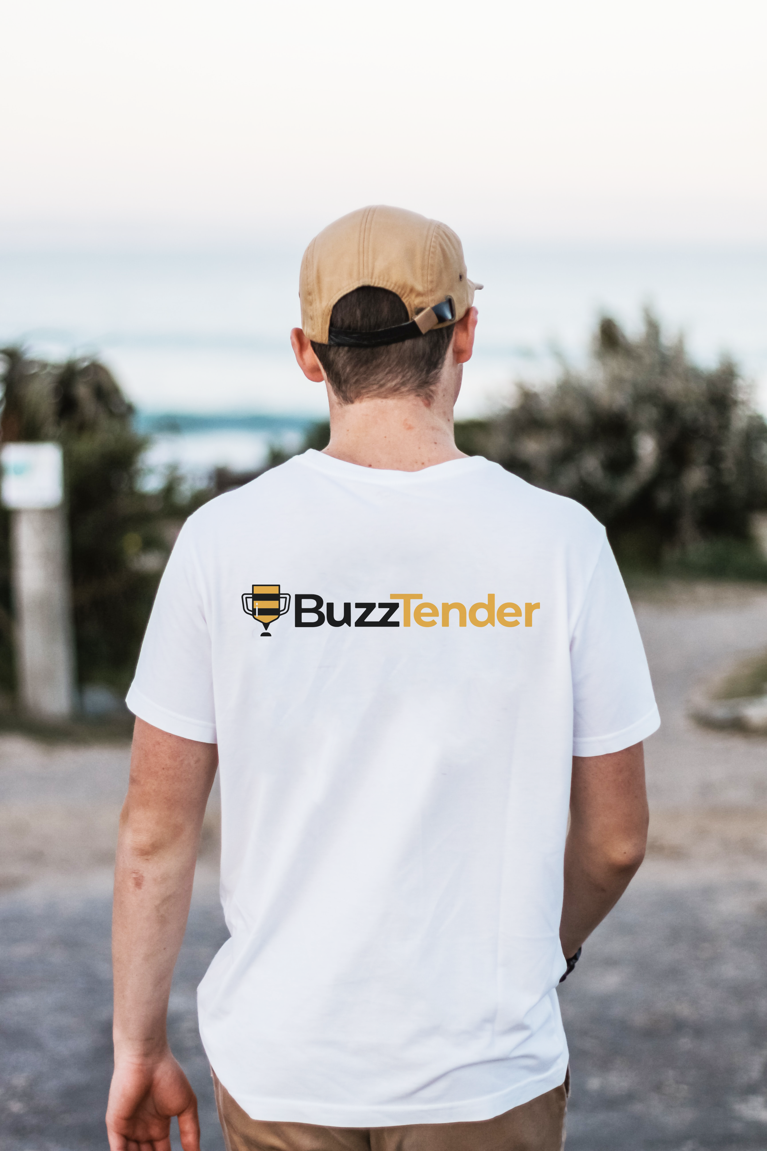
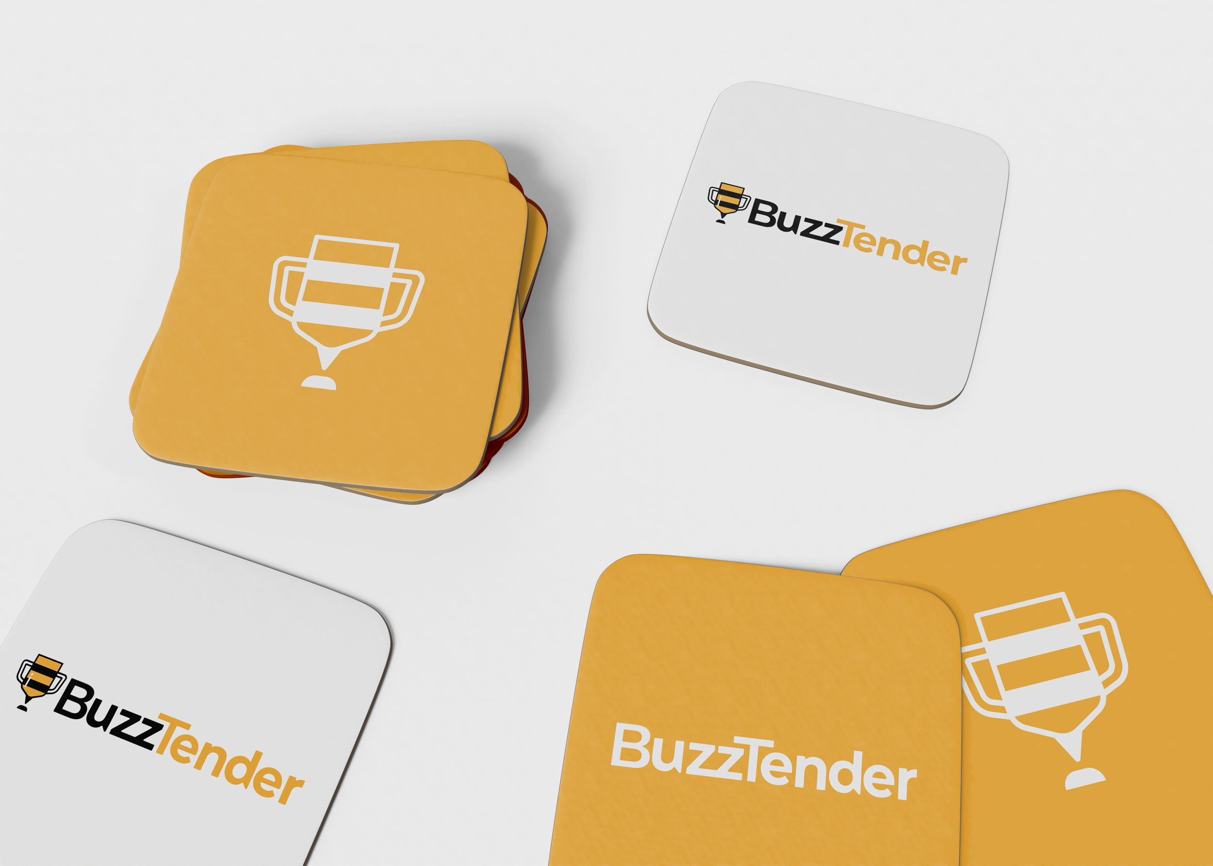
Drawing inspiration from the essence of competition that drives BuzzTender, the icon design seamlessly merges a trophy with a bee. The bee's subtle presence is cleverly incorporated, with the trophy handles doubling as wings and the trophy base serving as the stinger. The name "Buzz" not only pays homage to the bee icon but also symbolizes the vibrant community the app fosters. The two-color word mark enhances understanding, while the "stinger" motif is echoed in the spur of the "u" and the "d."


brand
Given the predominantly mobile viewing experience, the BuzzTender team sought a simple yet high-contrast color scheme that would accentuate the distinctive "Bee" icon. Yellow and black emerged as the natural choices. Additionally, the style guide encompasses various design elements, such as icons for diverse games and competitions, as well as a visual system for "Leadership badges." These cohesive assets align with the brand's vision and enhance the overall user experience.

Outcome
Equipped with a captivating logo and comprehensive graphic standards, the BuzzTender team successfully completed the app development, culminating in a launch in late 2022. Since then, the app has continued to redefine the concept of community building, bringing people together through transformative experiences and fostering lasting connections among friends and acquaintances.